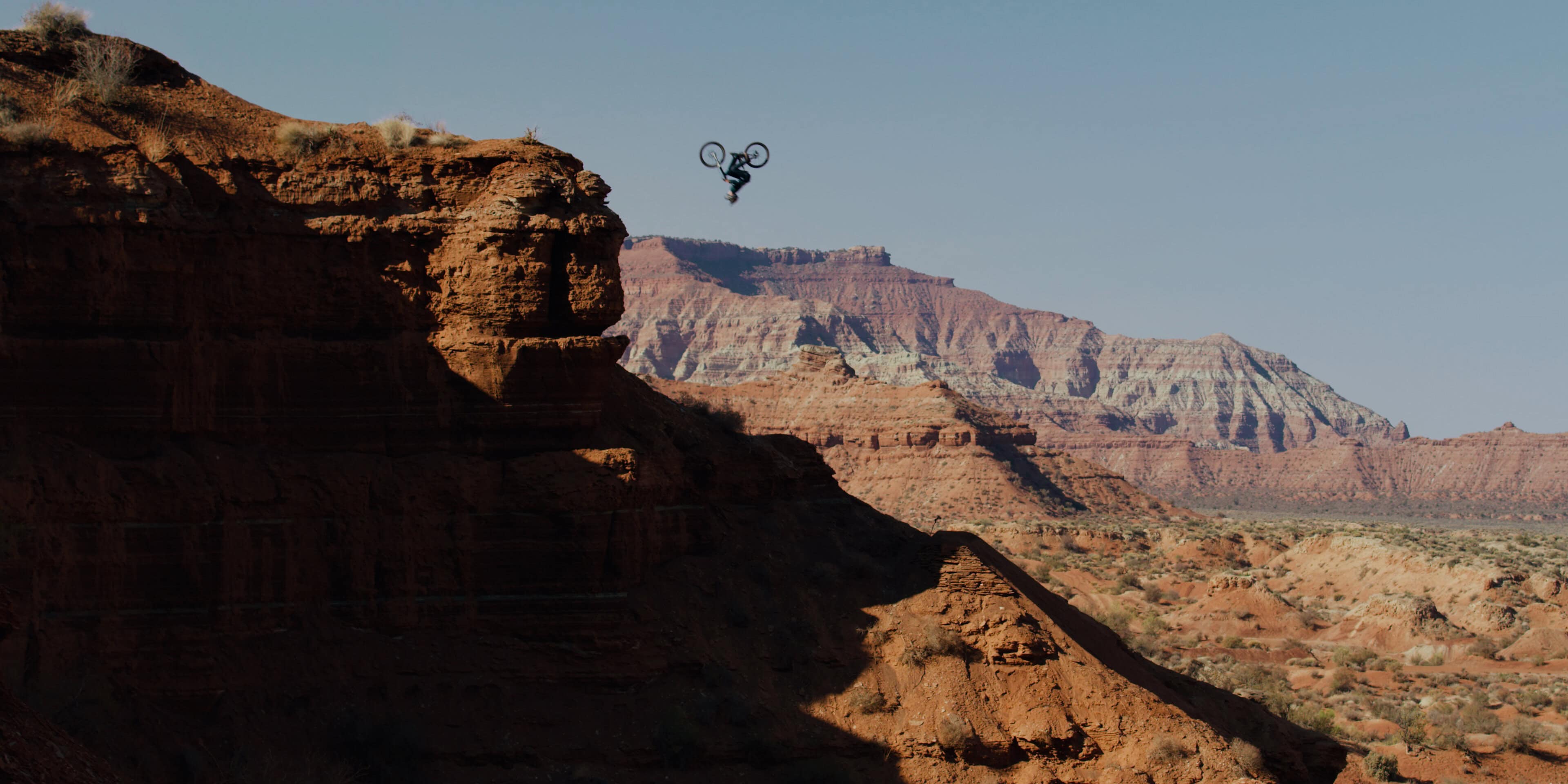
Riding Off Cliffs
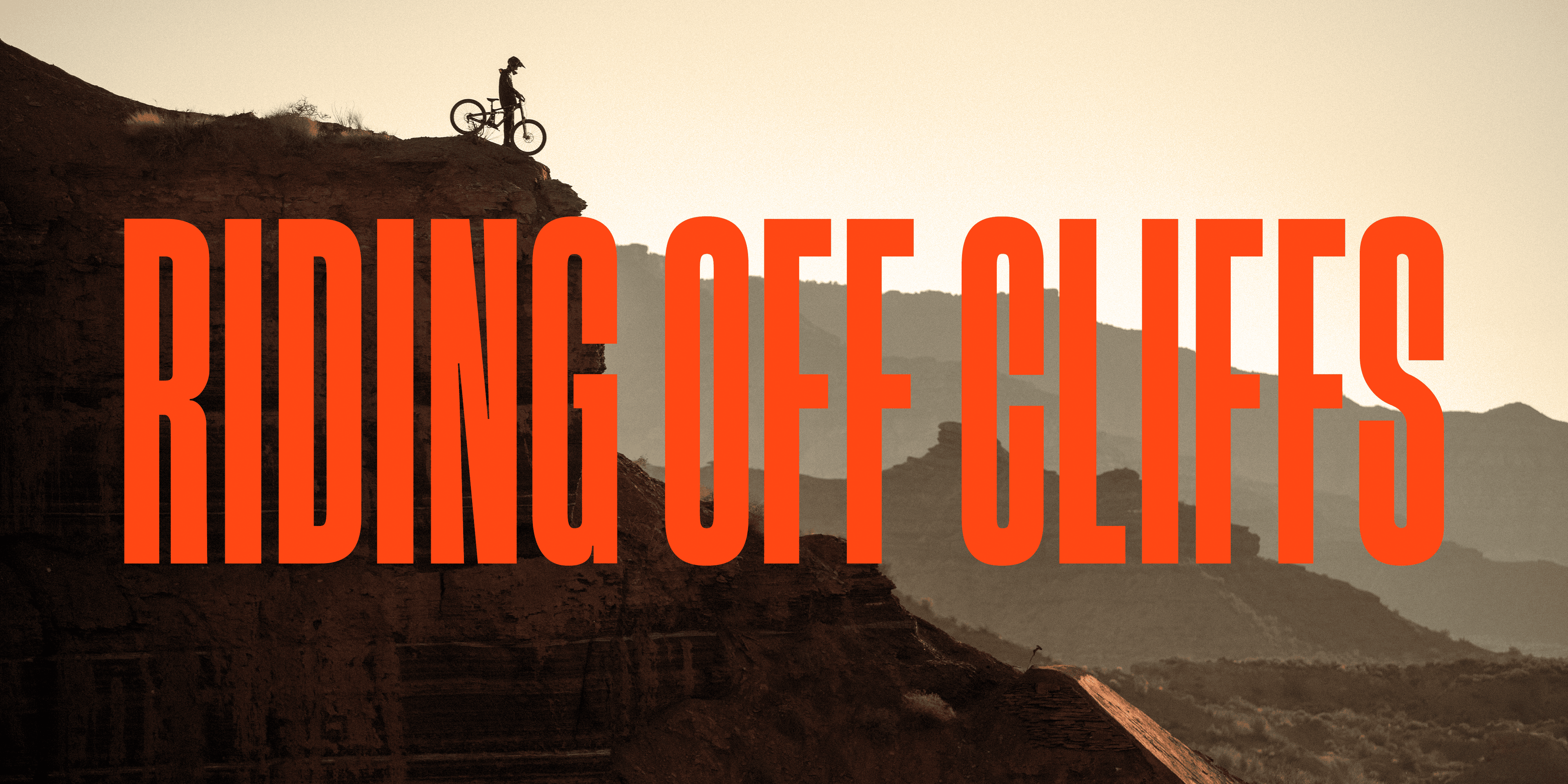
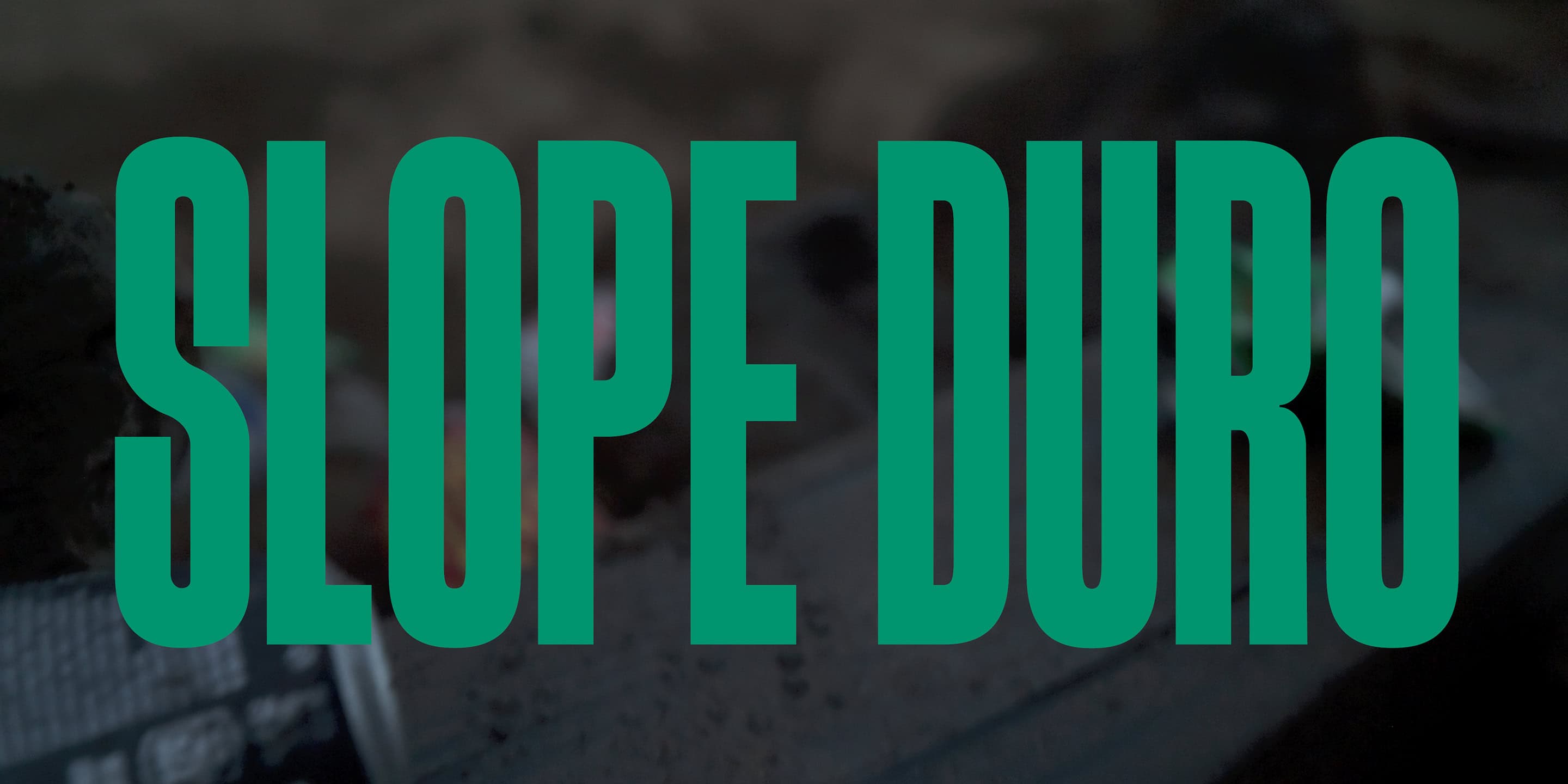
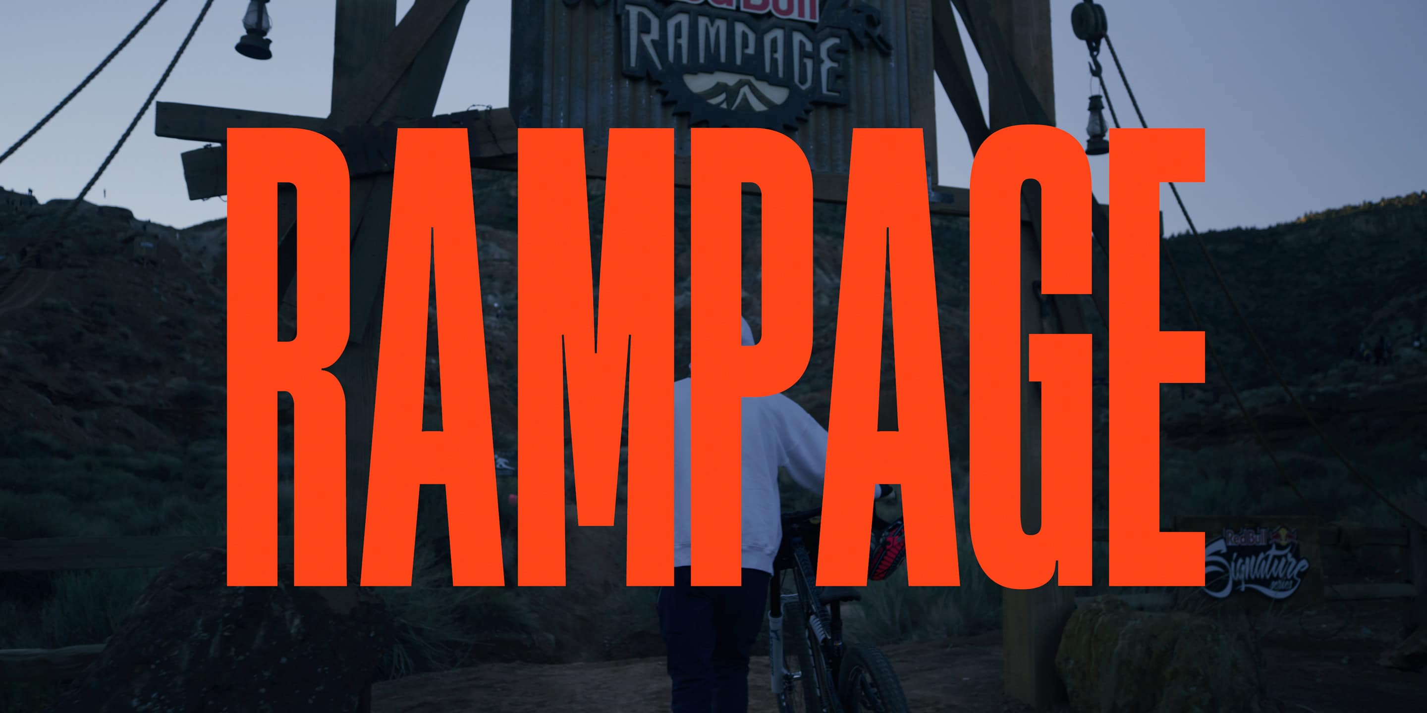
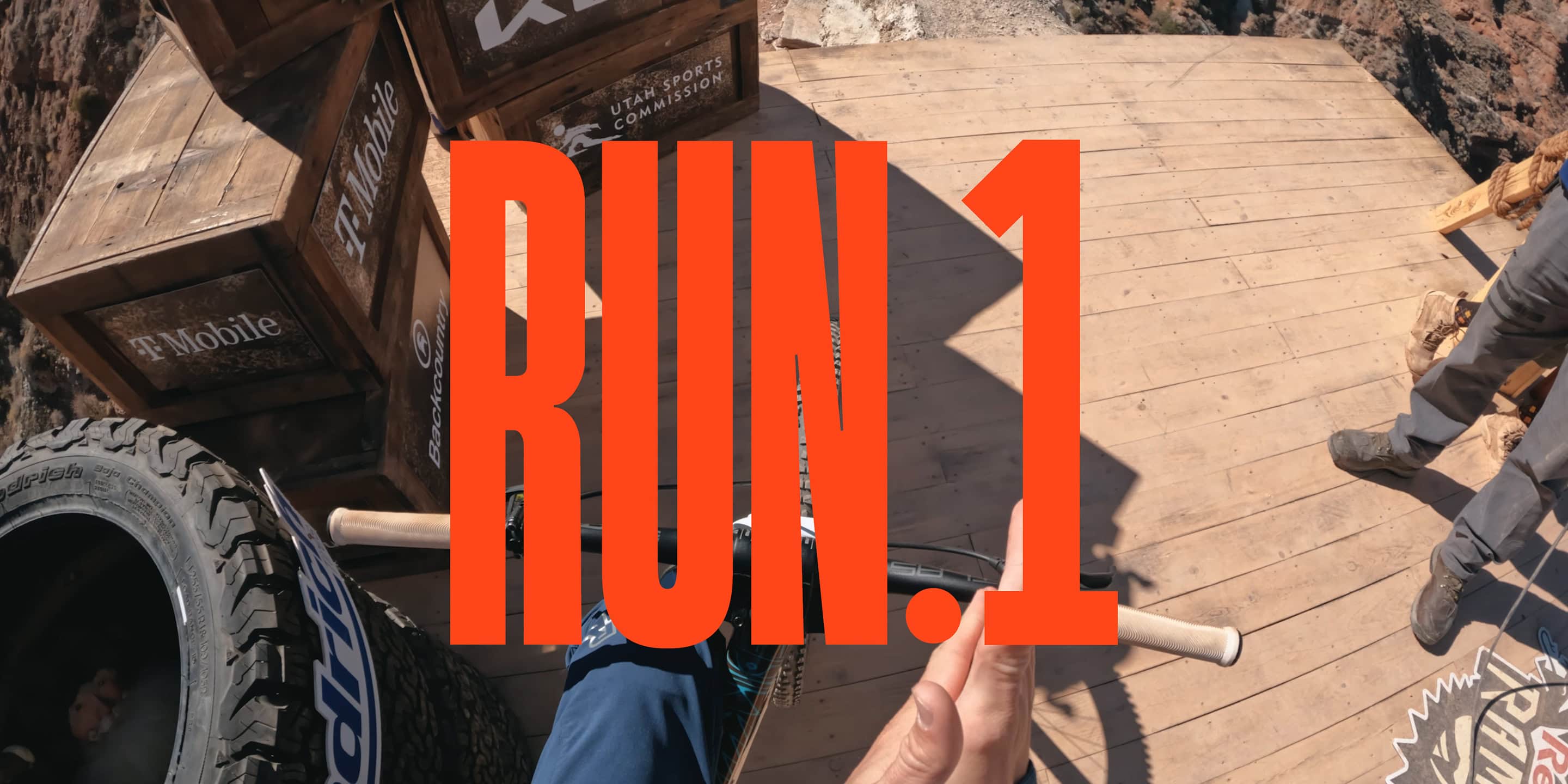
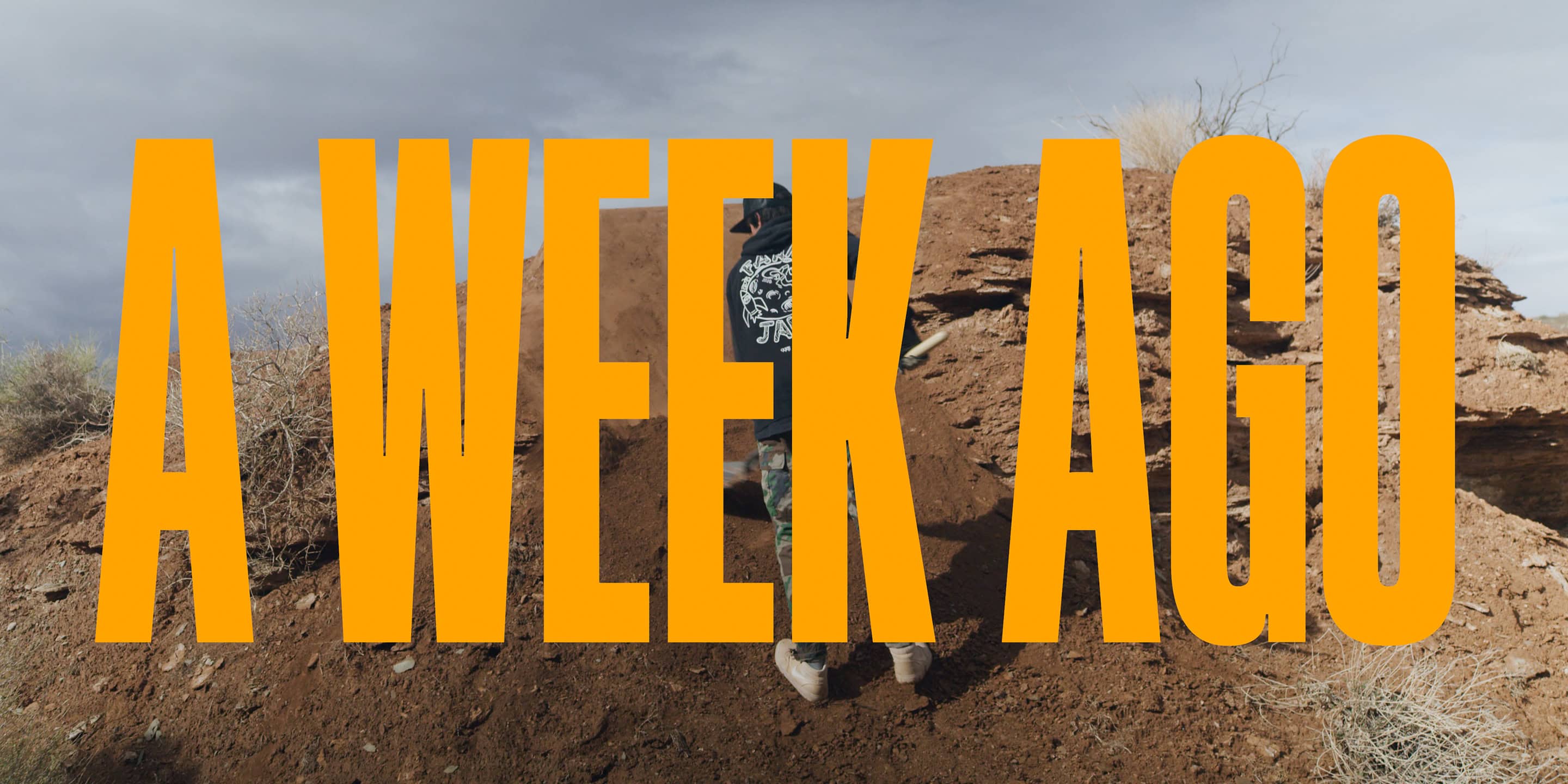
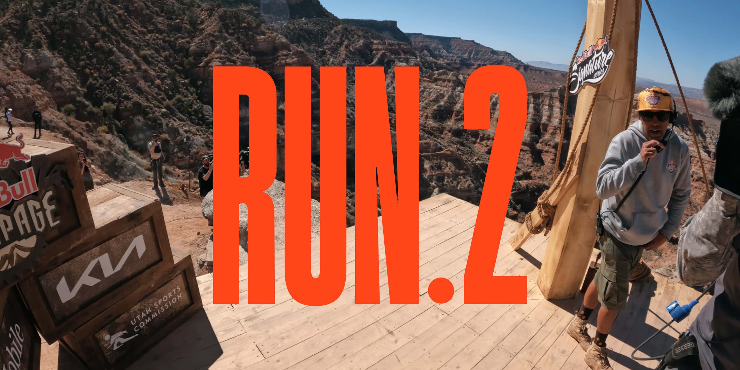
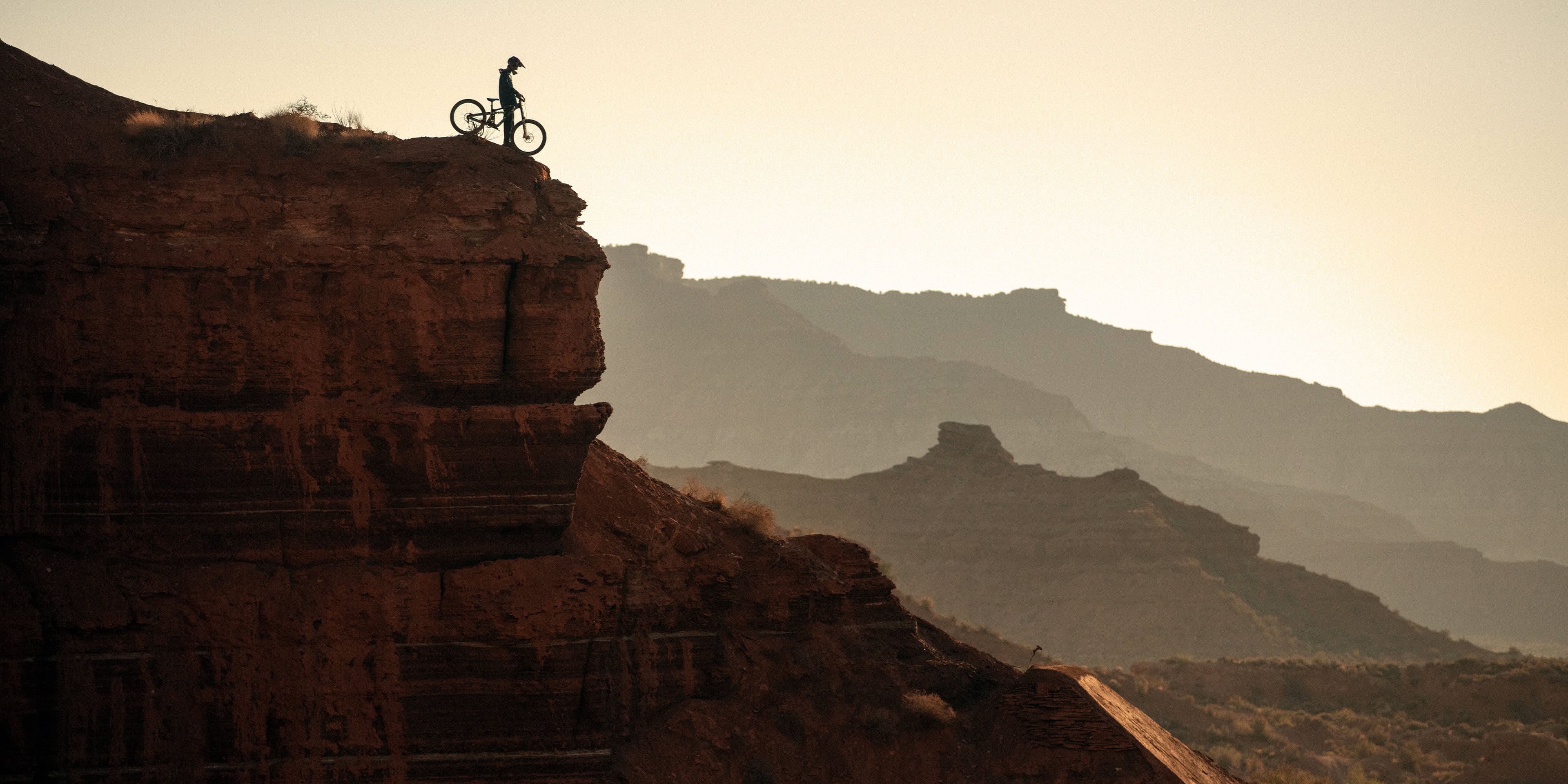
Title sequence and design for a Freeride documentary. Tasked with creating a treatment style that mirrored the big scenes of the film's key moments, an expanded typography treatment was developed that could be scaled and sized to each scene. Earth-toned hues of the type complemented the natural colors of the scenes. Fancy motion graphics were eschewed. Instead, the oversized elements popped onto the screen, adding to the stark contrast of the bold visuals.
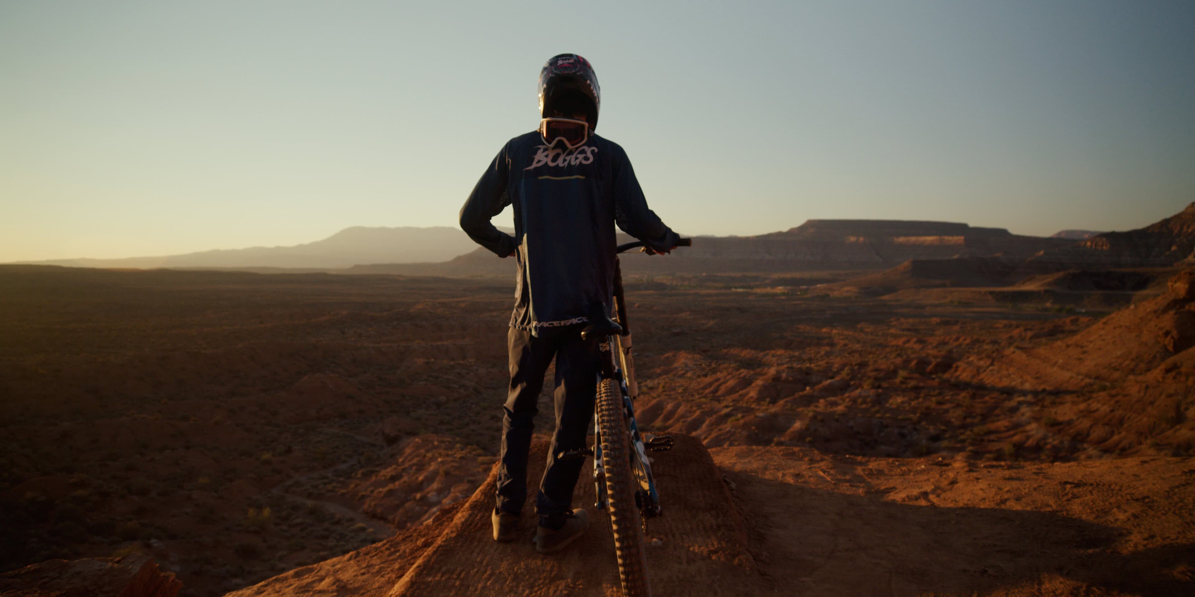
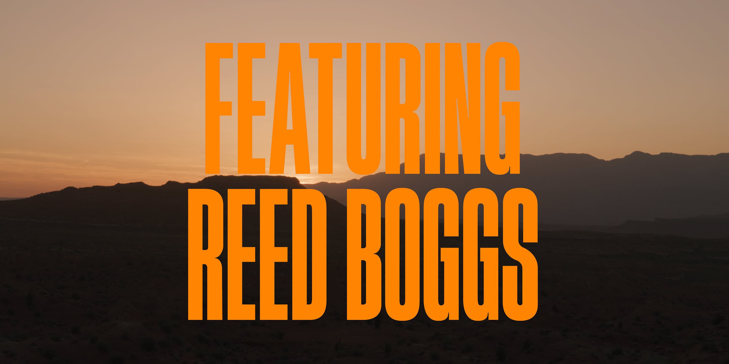
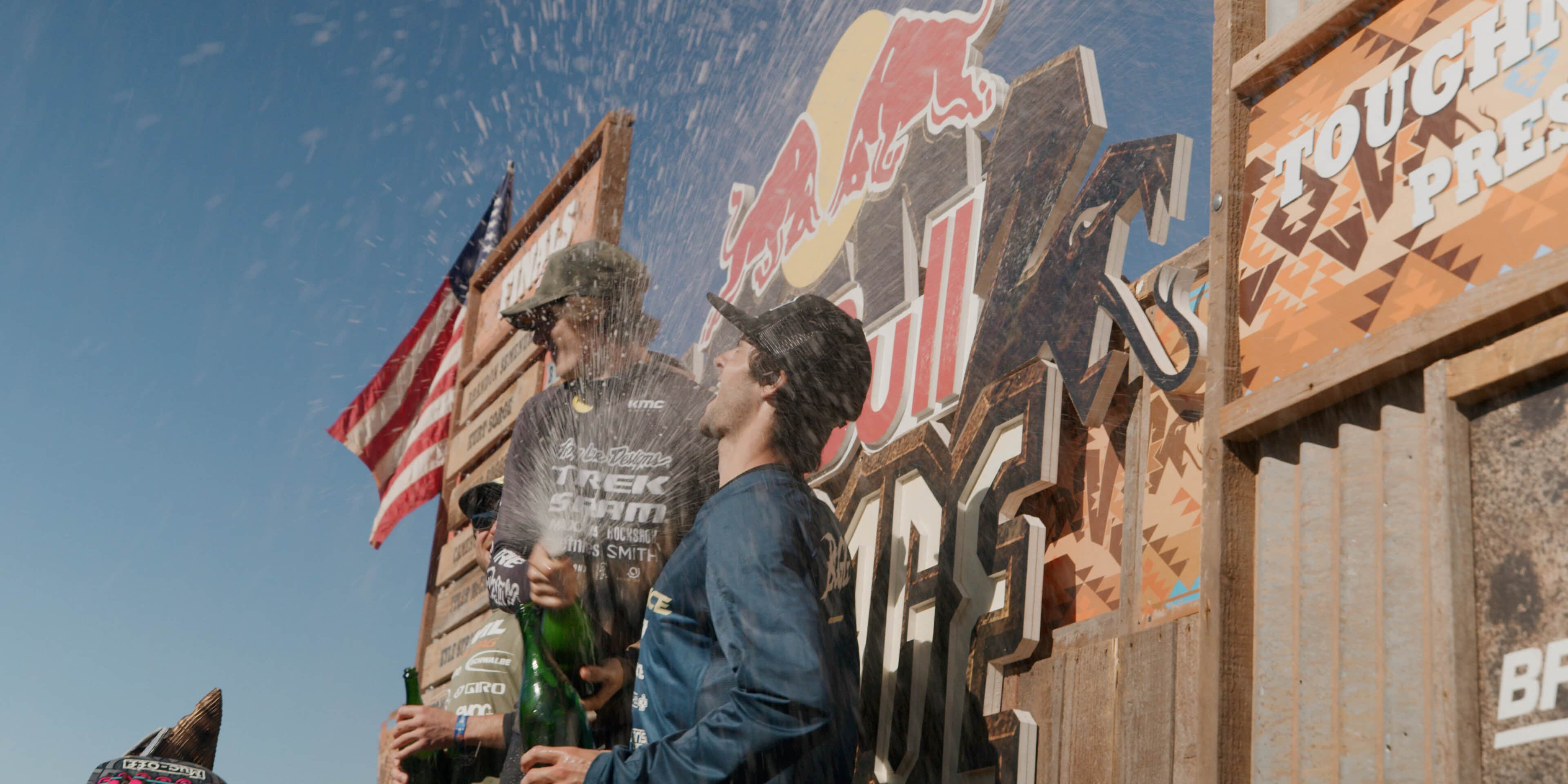
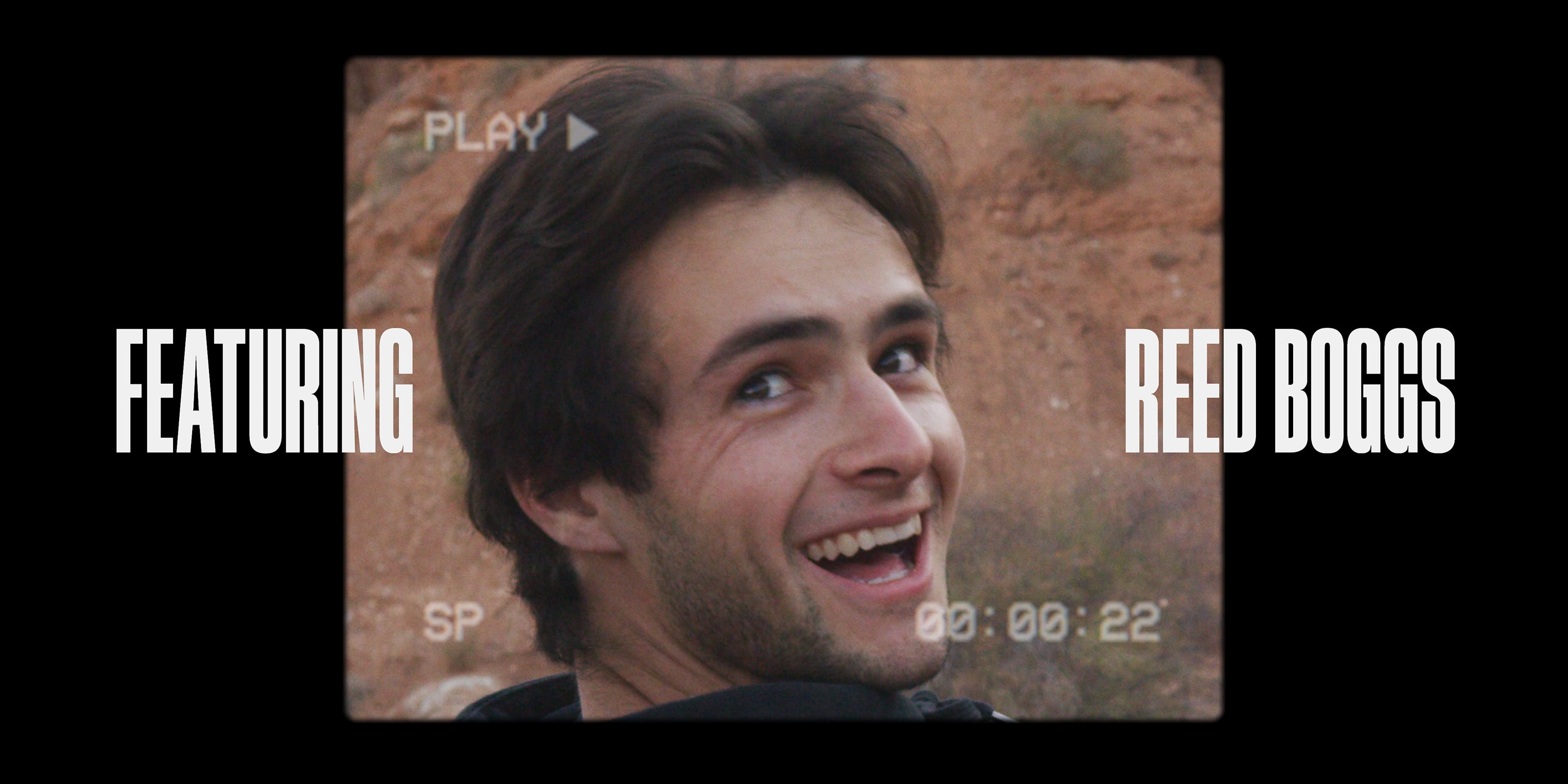
Reed Boggs pursuit of livin' the Freeride dream.
Title sequence and design for a Freeride documentary. Tasked with creating a treatment style that mirrored the big scenes of the film's key moments, an expanded typography treatment was developed that could be scaled and sized to each scene. Earth-toned hues of the type complemented the natural colors of the scenes. Fancy motion graphics were eschewed. Instead, the oversized elements popped onto the screen, adding to the stark contrast of the bold visuals.
INFO
FOX Factory, Yeti Cycles & Race Face
ClIENT
Creative Direction
Title Design
Motion Development
MY—ROLE